
Case · Real estate · Brand redesign
- Client
- Trigo Branco Imóveis, a high-end real estate agency.
- Challenge
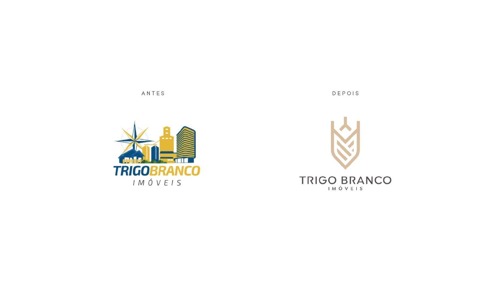
- The colorful, illustrated logo didn't match the promise of premium living made to clients.
- What we did
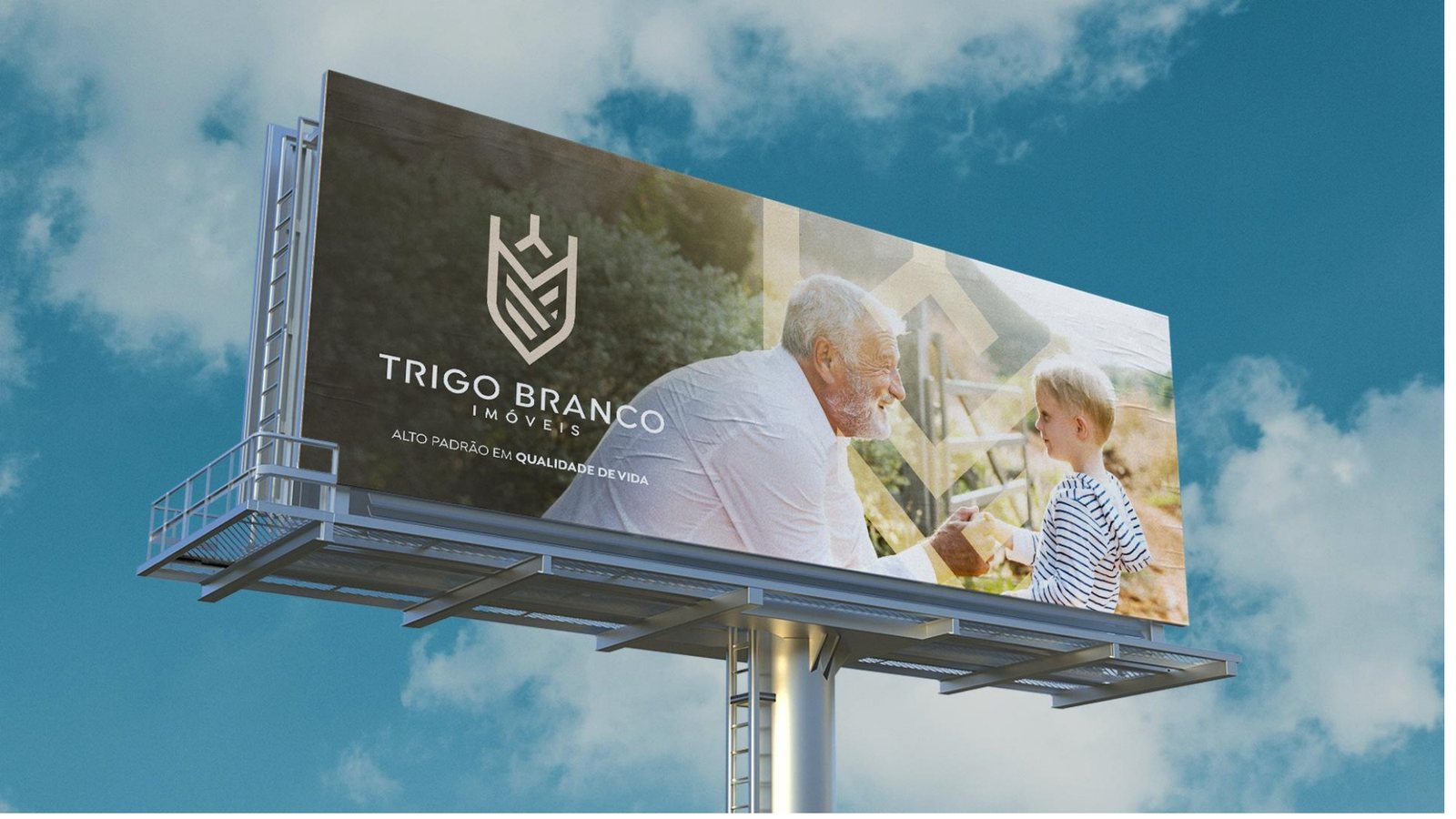
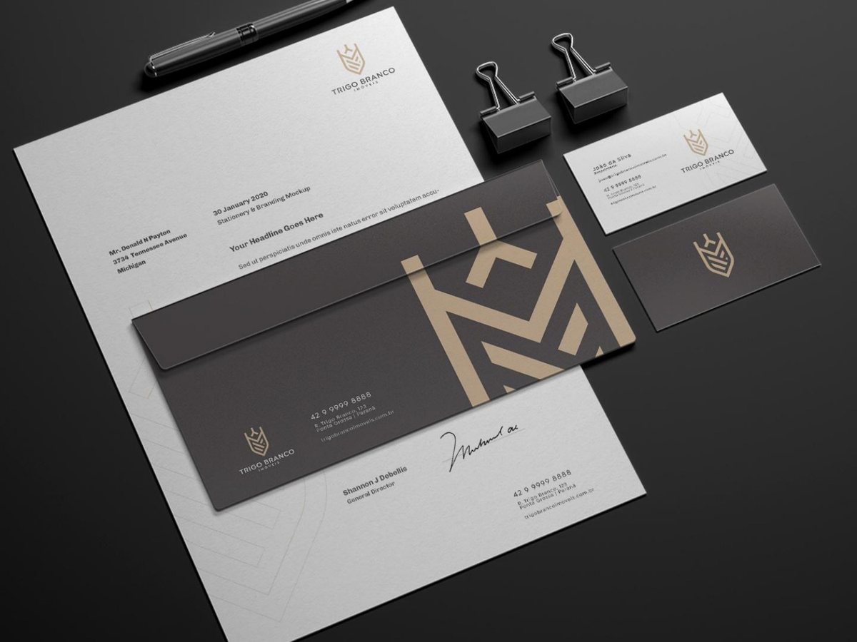
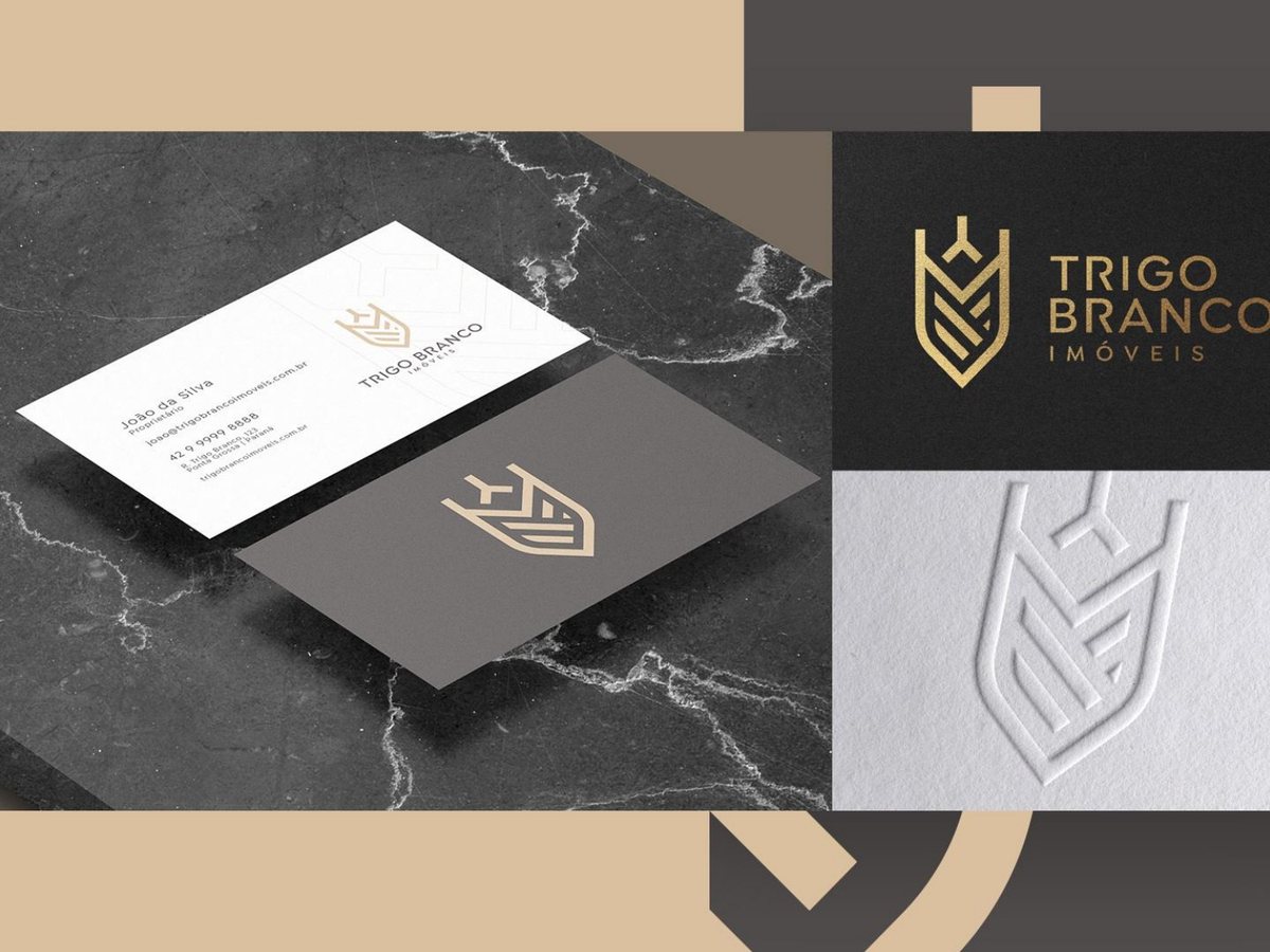
- New symbol (the wheat ear as a crest), restrained typography, black, white and gold palette, stationery, cards and billboard.
- Result
- The brand now carries the same value as the properties it advertises. Refined on the card, imposing on the billboard.
Services