
Case · Real estate and services · Brand redesign
- Client
- Bonafide, a group from São Paulo state with a real estate agency, an insurance broker and a travel agency.
- Challenge
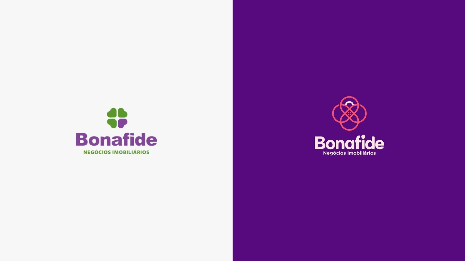
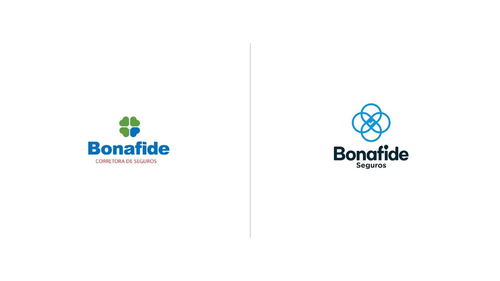
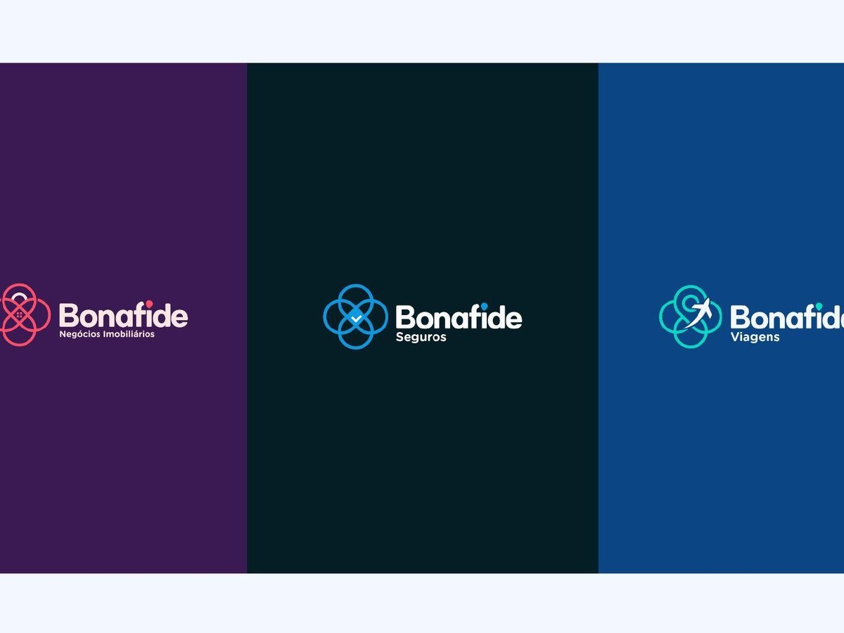
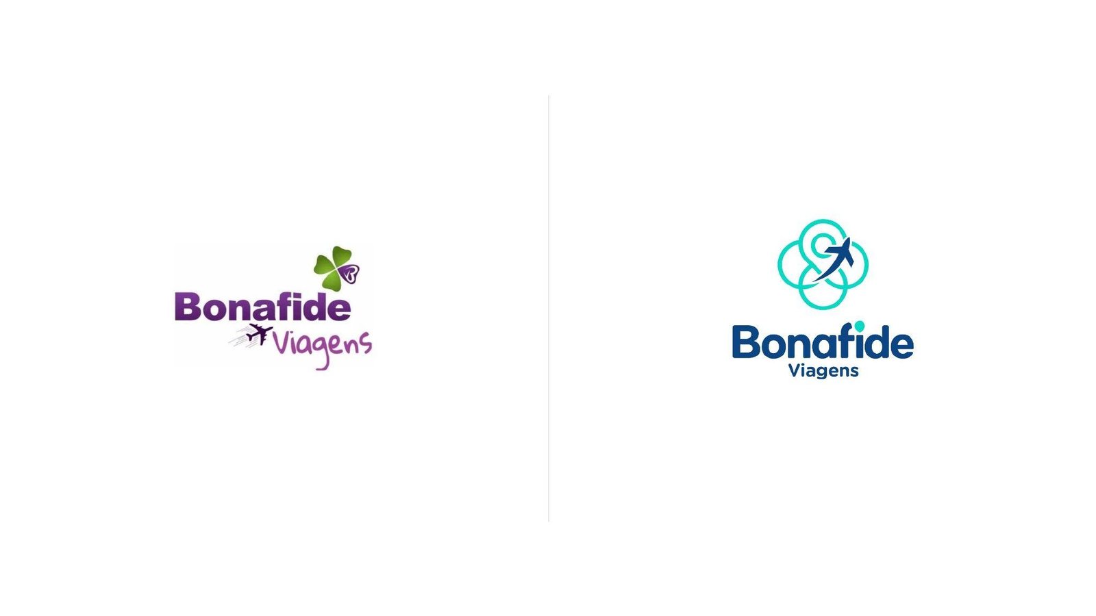
- Three unrelated logos (a clover, a plane, loose letters) for three companies of the same family. Trust, responsibility and professionalism needed a single face.
- What we did
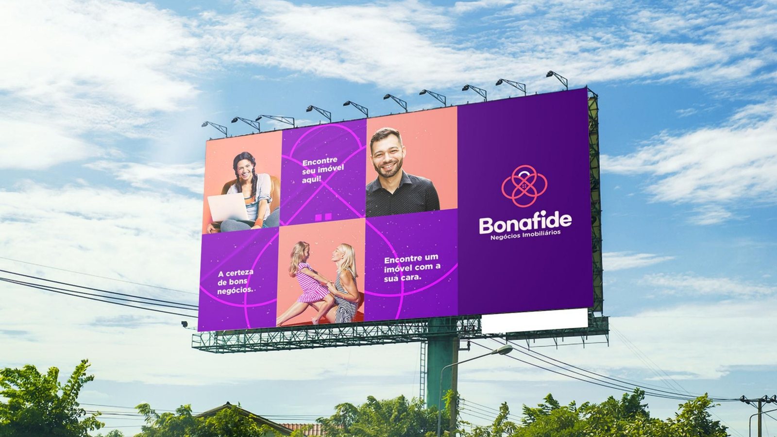
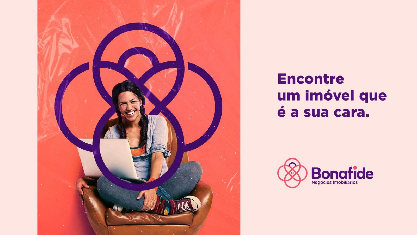
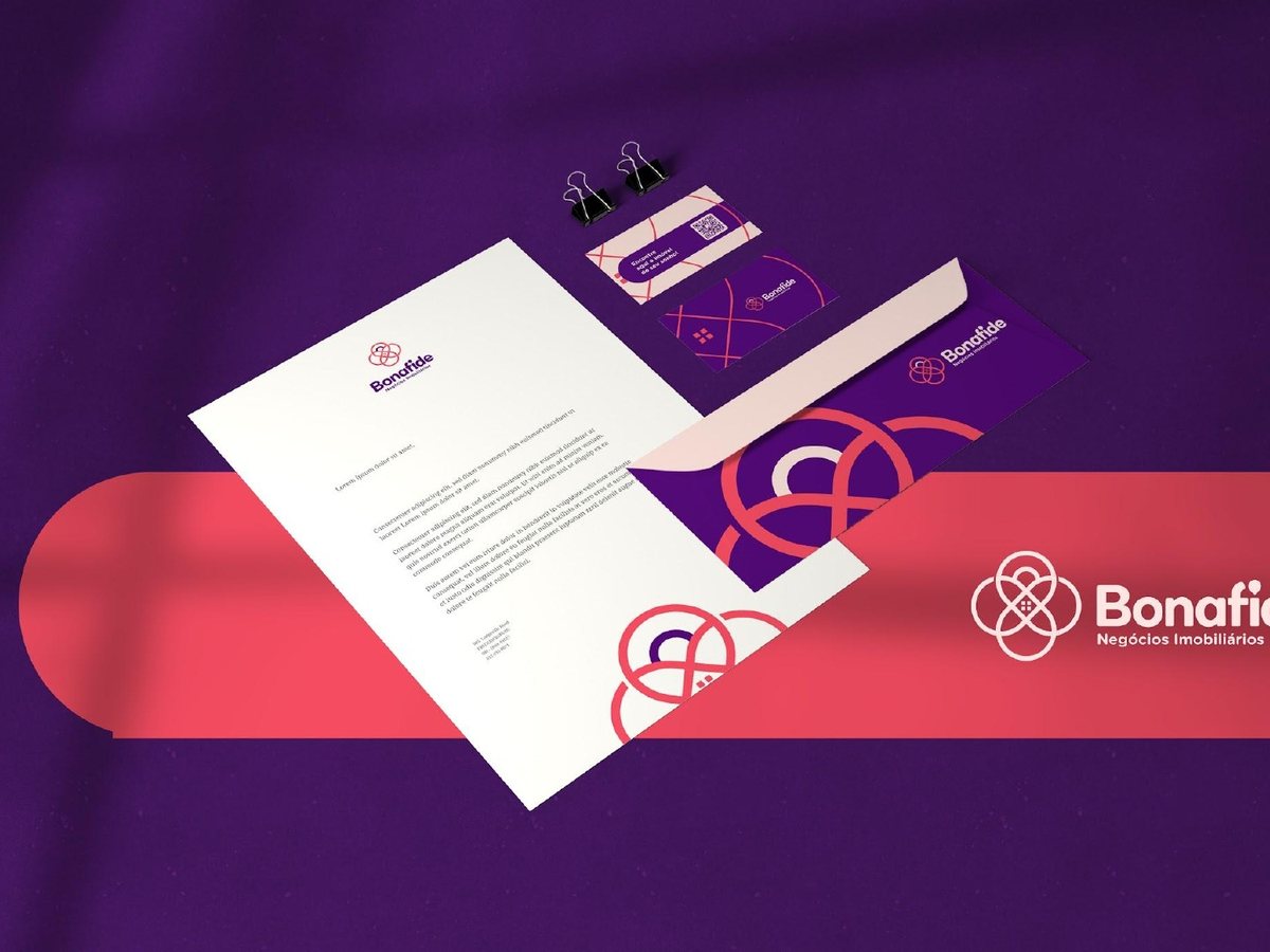
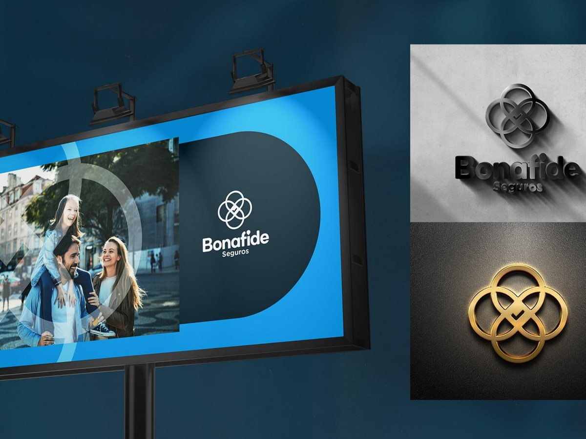
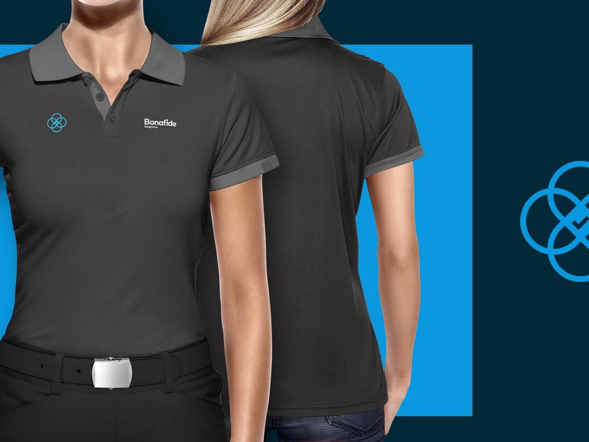
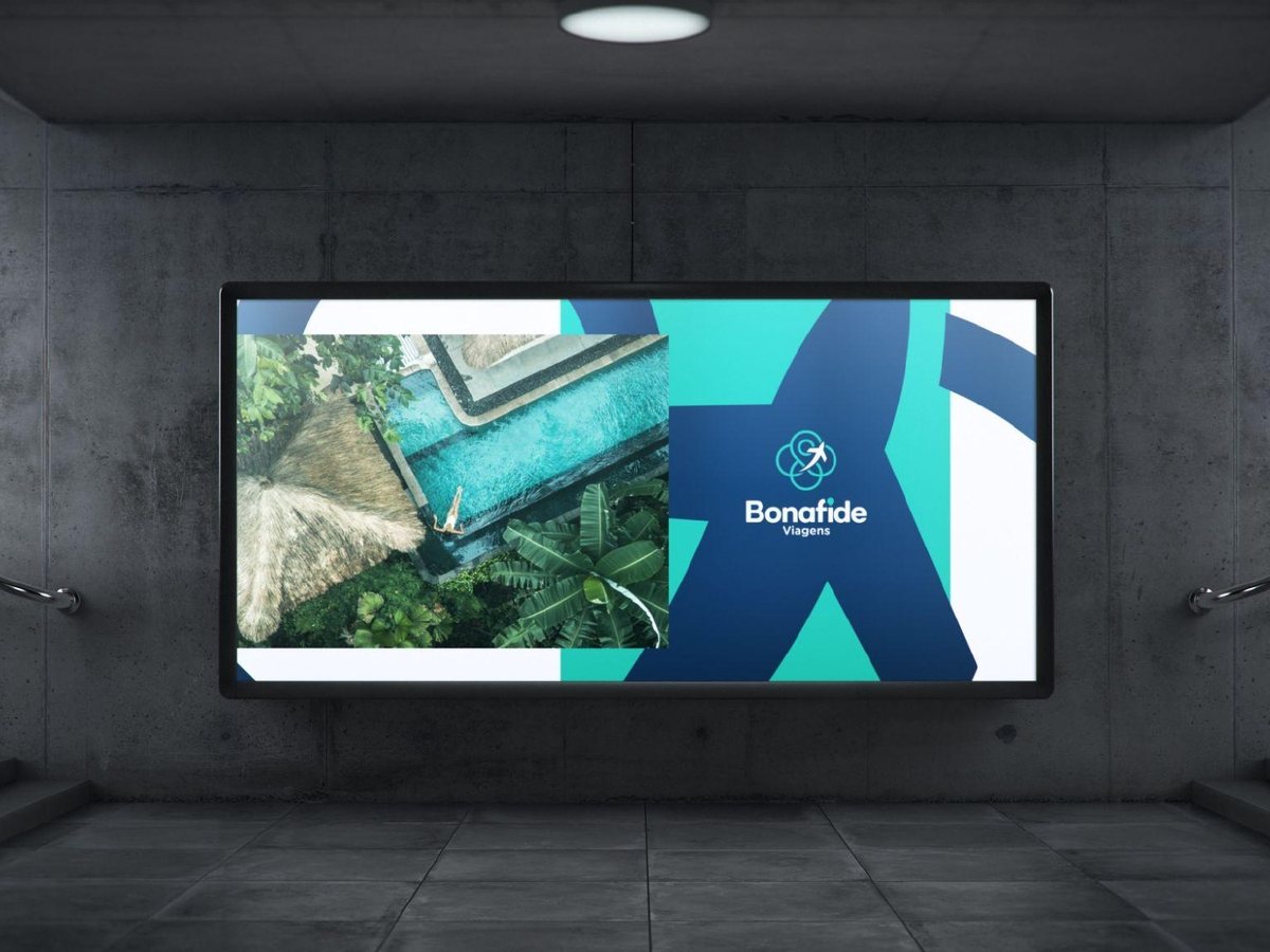
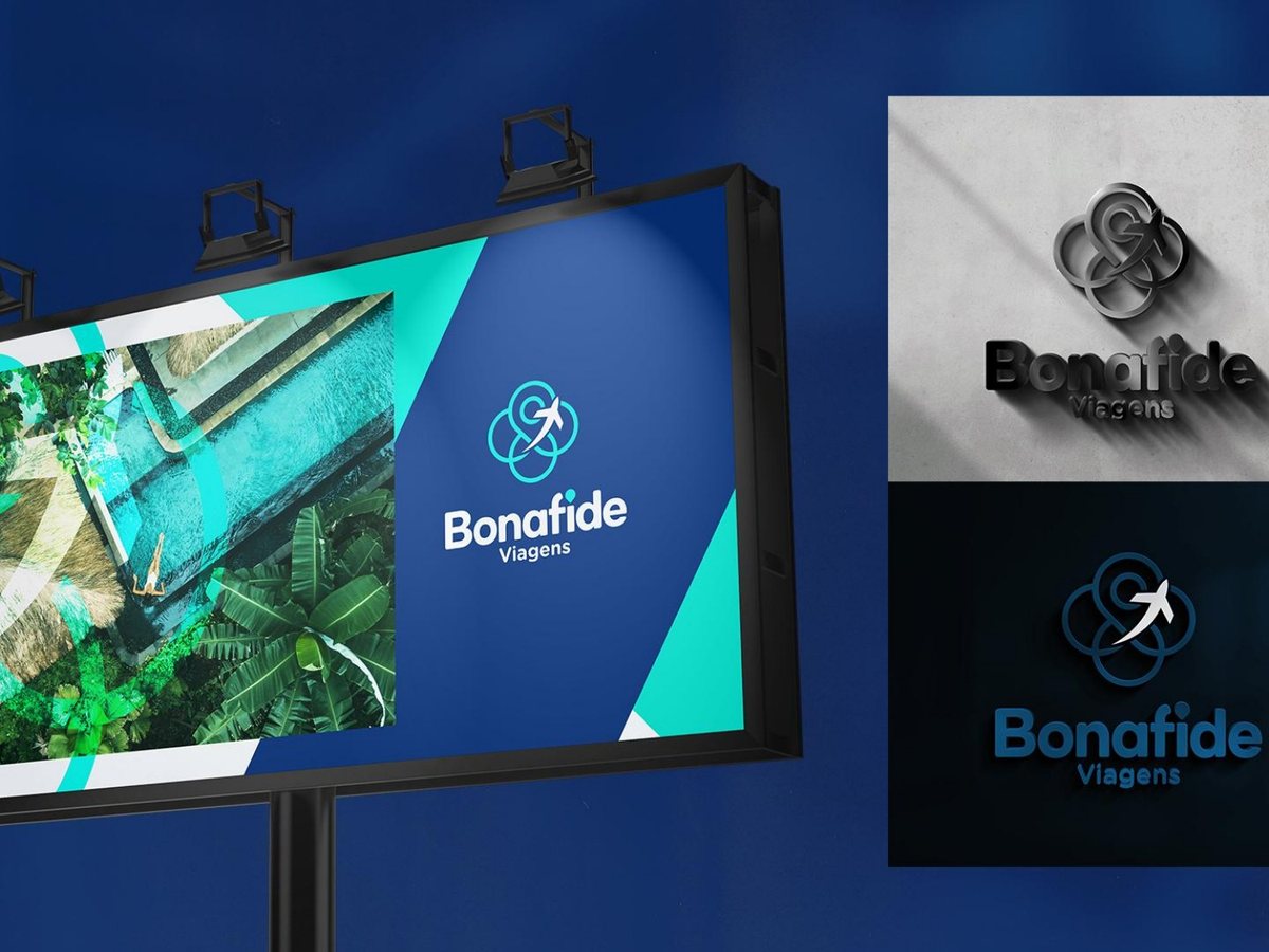
- New interlocking rings symbol shared by the three brands, color-based brand architecture (purple for real estate, blue for insurance, teal for travel), the “Find a property that looks like you” campaign, stationery, uniforms, mupis and billboard.
- Result
- From three companies that looked like competitors to a group recognizable from afar. Each business with its own color, all with the same last name.
Services