
Case · Retail · Brand redesign
- Client
- GGPEL, a department store with stationery, electronics and crafts.
- Challenge
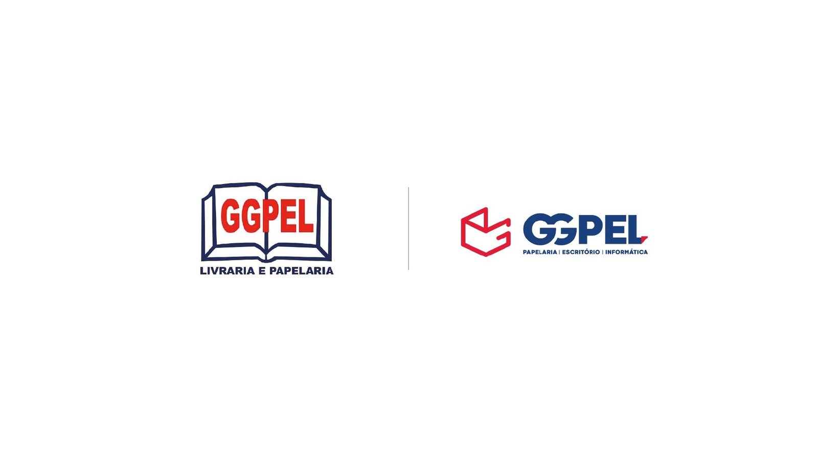
- A neighborhood stationery-shop logo for a business already serving at least five customer profiles, from corporate purchasing to back-to-school parents.
- What we did
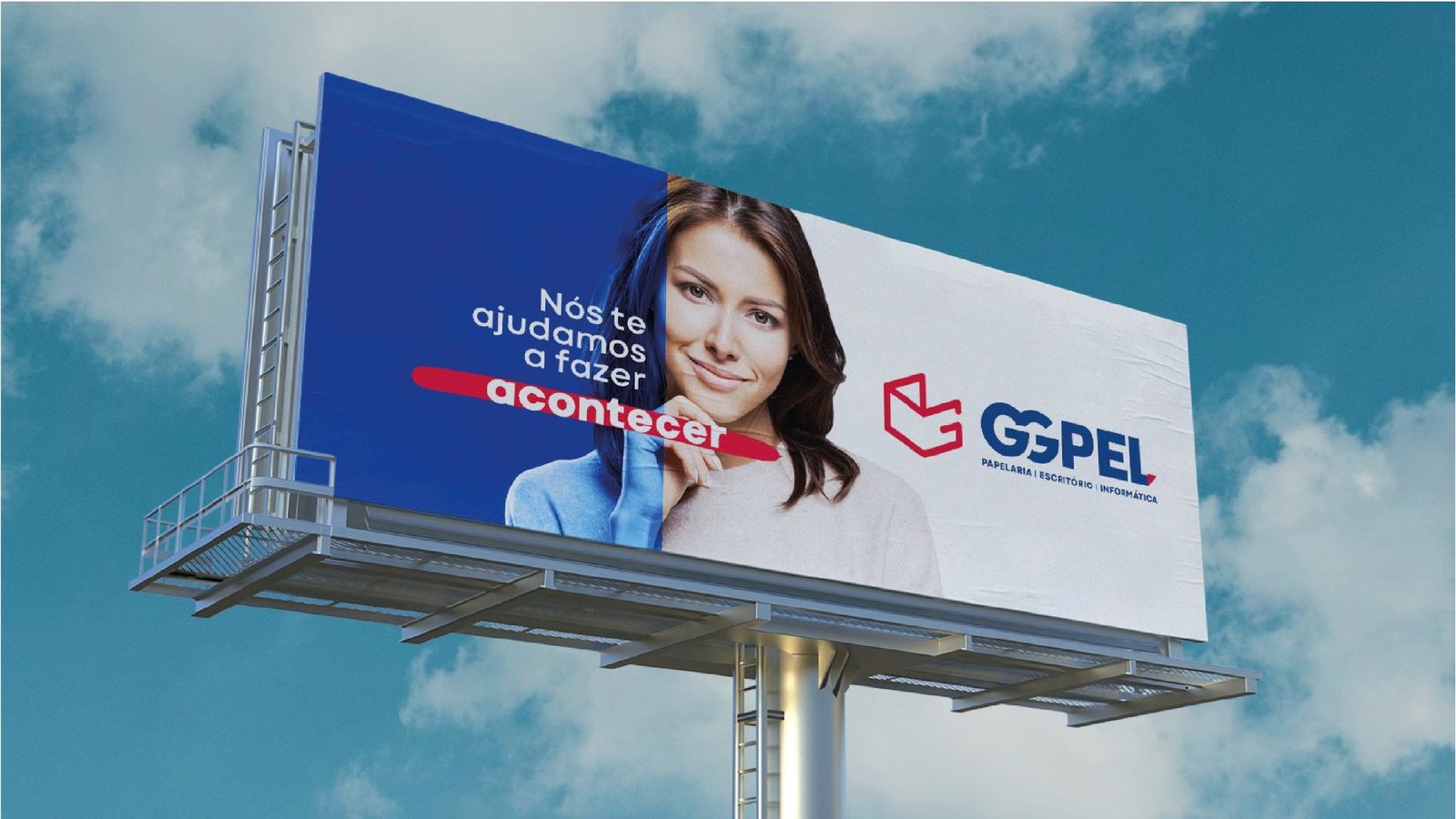
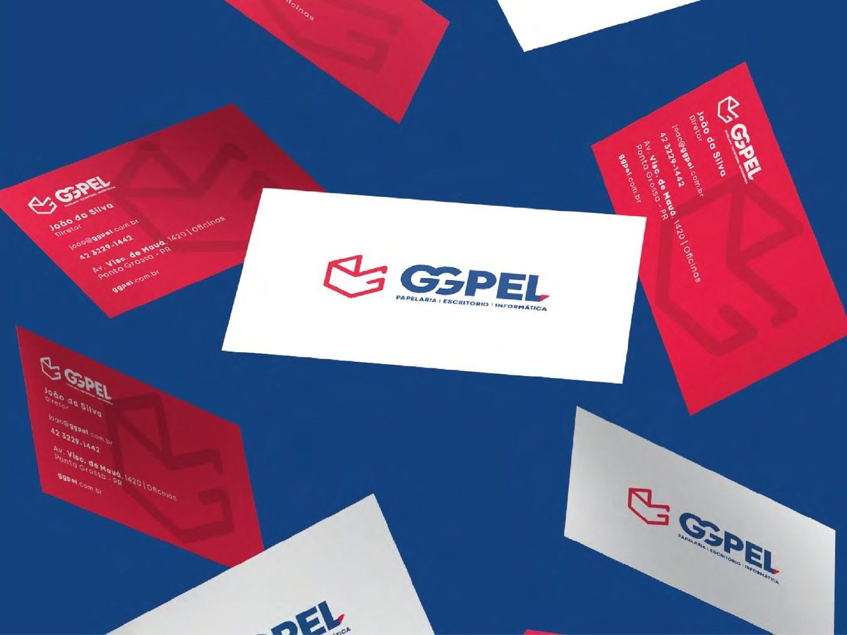
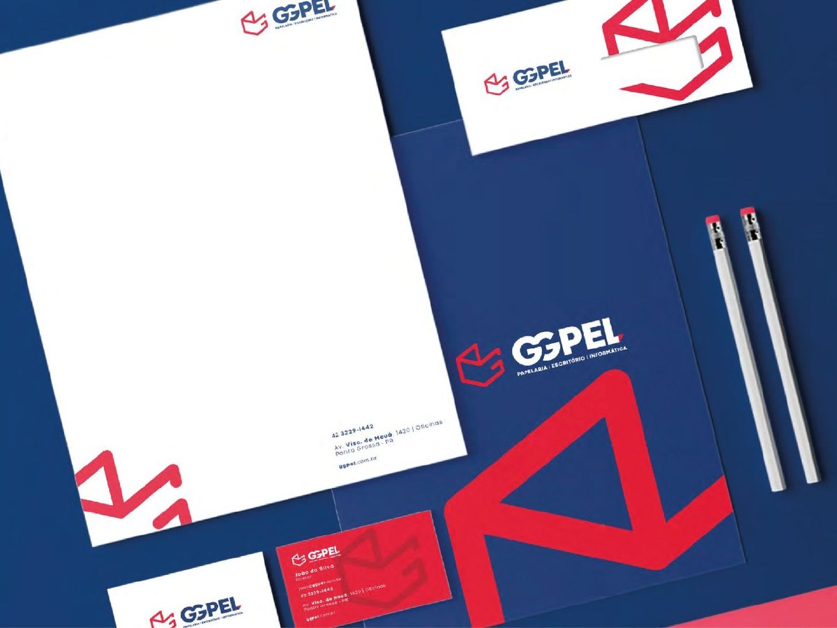
- New G symbol, signature, blue and red palette, audience-based card system, stationery and billboard.
- Result
- Forward-thinking and varied in a single brand. GGPEL stopped looking like a stationery shop and started looking like what it is: a department store.
Services