
Case · Real estate development · Brand redesign
- Client
- KRCON Empreendimentos, a real estate developer in Brazil.
- Challenge
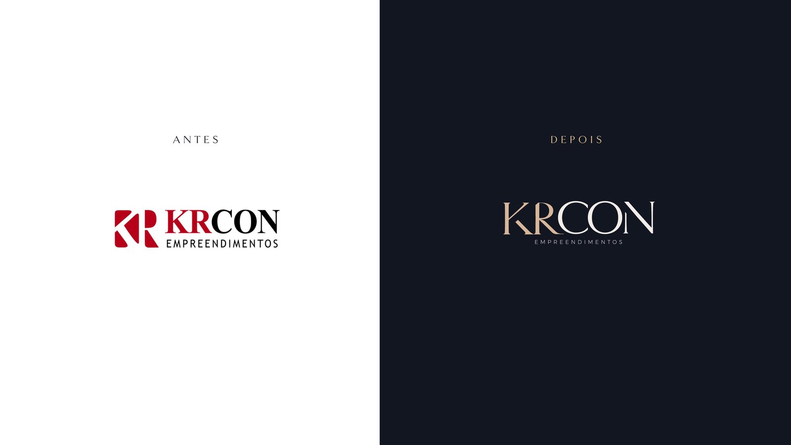
- The old brand, red and heavy, spoke the language of retail. The developments called for a high-end signature.
- What we did
- New KR monogram, signature with fine serif typography, deep blue and gold palette, pattern and brand guidelines.
- Result
- A brand that adds value to the product before launch: restrained, elegant and looking like a development that doesn't need to shout.
Services