
Case · Construction · Brand redesign



- Client
- JMC Construtora, a developer of high-end buildings in Brazil.
- Challenge
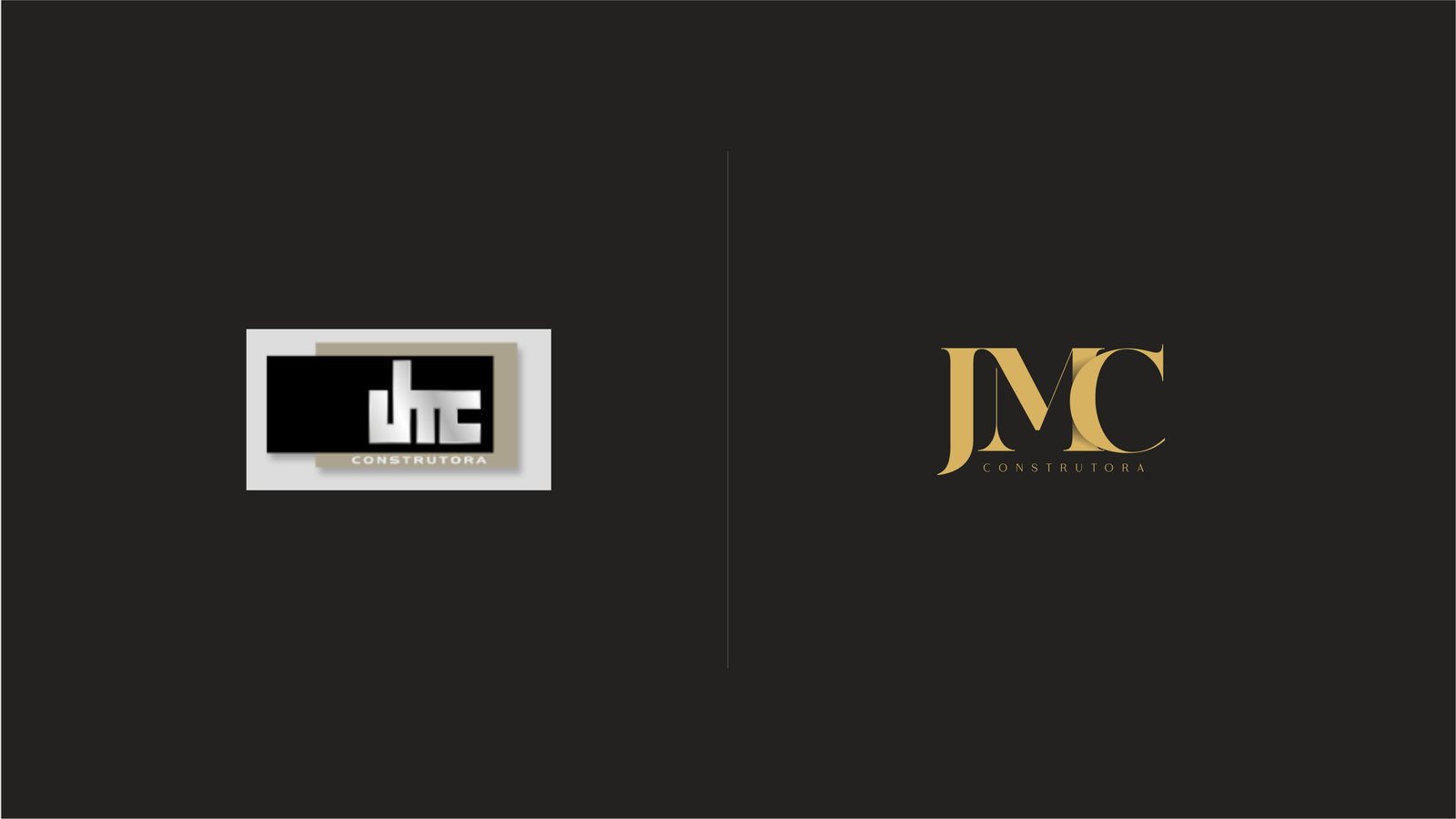
- The old logo, heavy and generic, didn't carry the value the company delivers in its developments.
- What we did
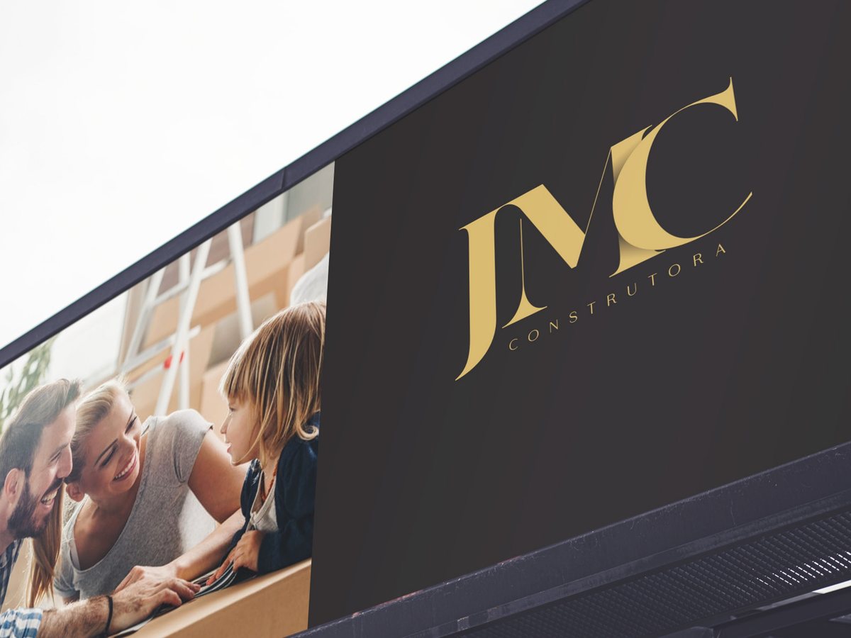
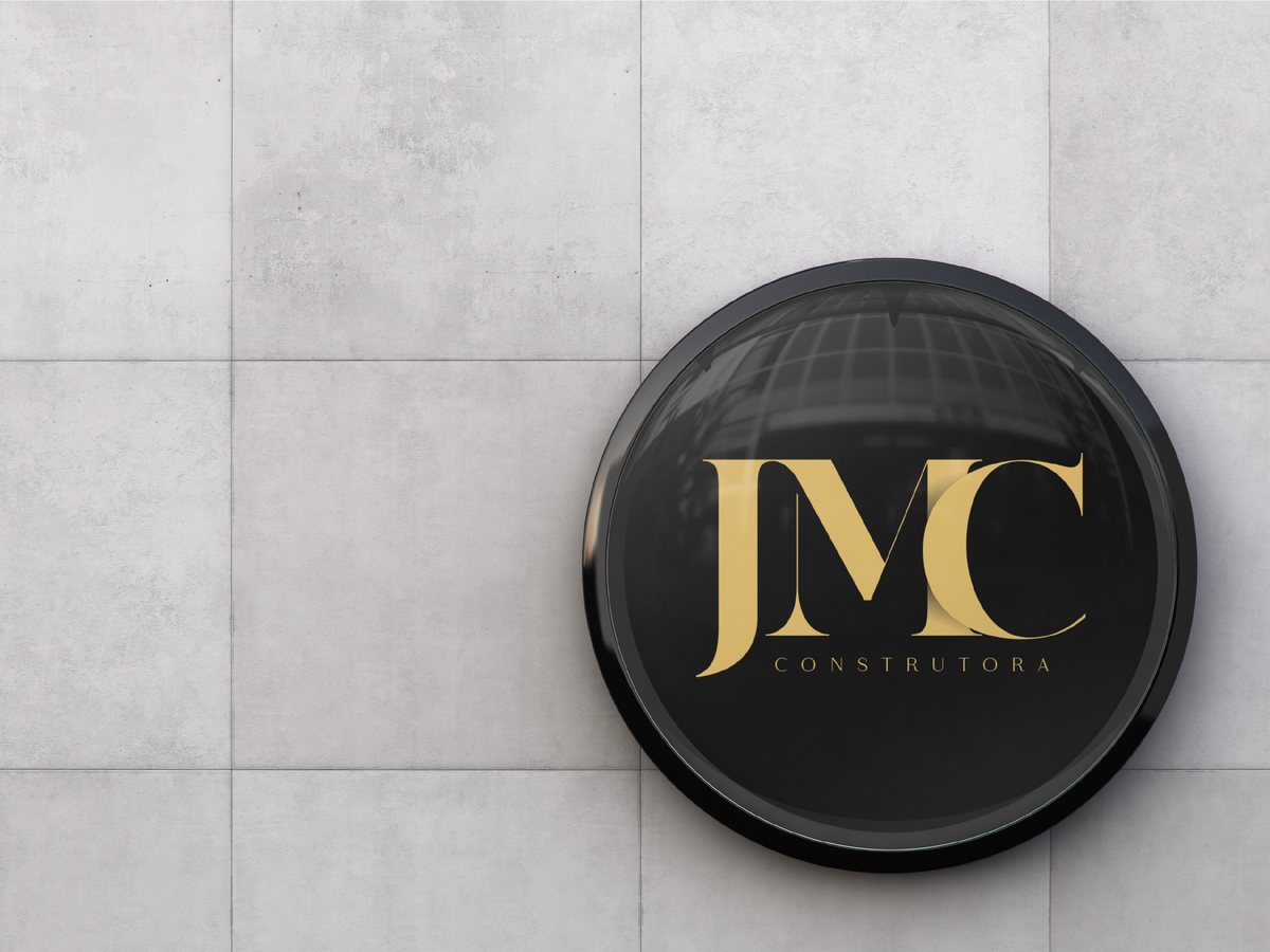
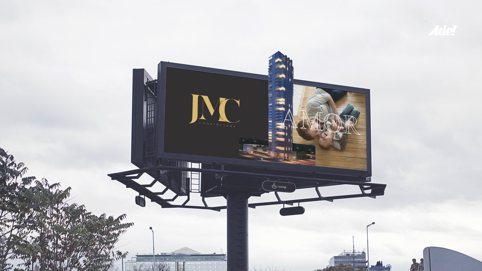
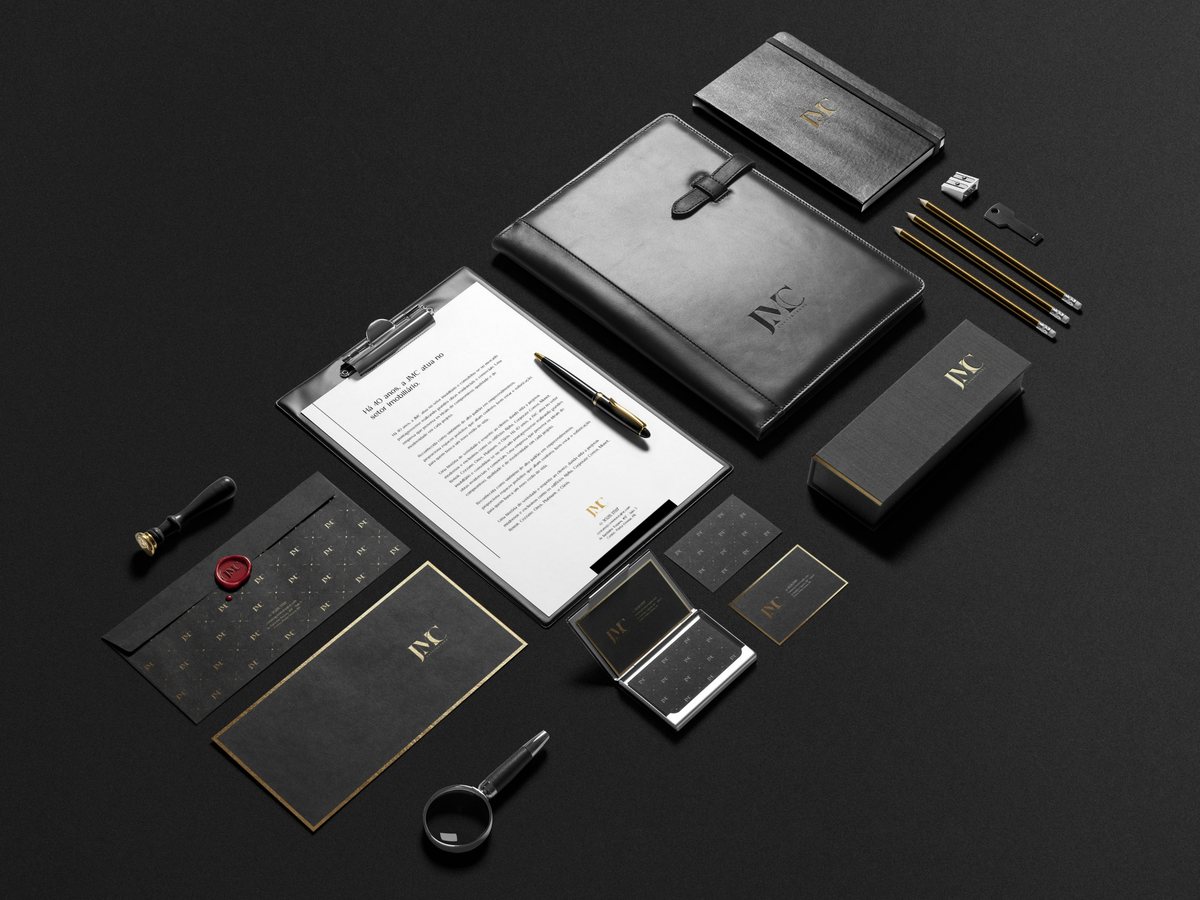
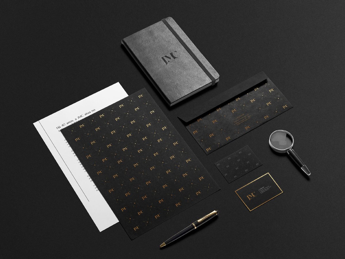
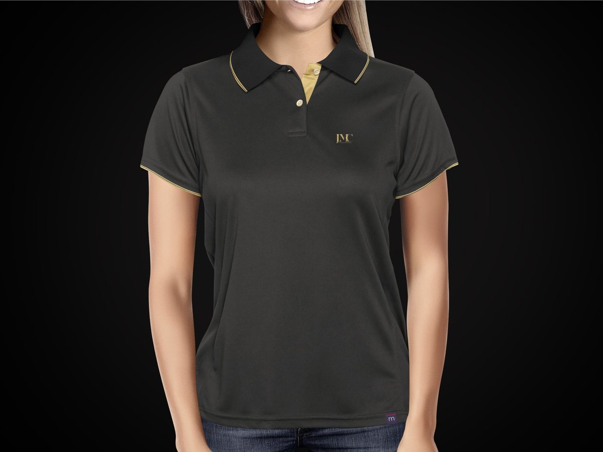
- JMC monogram with fine serifs, proportions set by the golden rectangle and Gestalt principles, black and gold palette, pattern, stationery, uniforms, signage and billboard.
- Result
- A brand that looks like a jeweler's mark for a builder. Discreet on the card, imposing on the façade.
Services